Friday, February 11, 2011
Photoshop Notes
In photoshop, you can save your selection. If you want to change the color you can go to image, ajustments, then hue selection. You may also zoom in your picture, spacebar will also be a shortcut, zoom- spacebar+crl, zoom out- spacebar+alt. If you want to add a section, shift, remove is alt.
Monday, February 7, 2011
Alex's Elements and Principles of Design Scrapbook
Below this post is a scrapbook containing the basic elements and principles of design in communications technology. Enjoy!
- Alex H.
- Alex H.
Line-
A line is an element of design that could appear loose, free or sharp. It is an important element that outlines the shape of any picture. When these lines repeat, it usually creates an impression to people who look at it such as amazement, confusion, sadness, or no emotion at all. Some can appear abstract like the one above, or some can be clearly identify such as a maze. This image contains lines that are loose and are sharp. These lines also repeat as seen, to create a spiral shaped pattern which could also portray a confuse or moody emotion.
Shape-
A shape is usually a contained, geometric area that can be defined very easily once looked upon. Some examples of basic shapes could be a square, a circle, a rectangle, a triangle or a rhombus. Usually many designers try to make up shapes that they create to draw attention rather than an ordinary circle. These shapes could be abstract and could look very appealing or ugly and could have psychological meaning. The image above is a smoking restriction sign. The outer shape of it is a circle. Notice that the circle with the slash in the middle emphasizes, "No smoking!", that is its psychological meaning.
Texture-
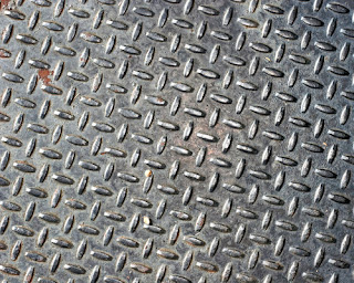
Texture is a term used to describe how an image will look or how it feels when touched upon. Different patterns on the texture of an image could explain the roughness or smoothness of the image. The image above is a plate of metal. As seen above, there are some sort of patterns on the metal plate. If you were to imagine rubbing your fingertips on the plate, it would feel hard and irritating like scratching a chalkboard.
Color-
Color is used in everything. Without color, it would be dull, boring and not as entertaining like the old t.v.'s. Color attracts attention, and almost all colors have a psychological meaning. The above image is a heart that is red. Most people would say that red mostly associates to love and romance, but there are also more meanings than that. For one, it could symbolize a source of energy, happiness or good health. Some cultures (i.e. the Chinese) believe that it is the color of good luck.
Harmony-
Harmony is when colors or elements go together or are compatible with each other. Such examples are red and orange, or green and yellow. Harmony is easily associated to the color wheel. It shows what colors go well together, and how colors are formed. Example, between red and orange is the color red-orange. This also means that red and orange go well together especially in the mixing part.
Rhythm-
Rhythm is when there is a repeating element or when something appears to be in motion. Rhythm can be very appealing if used with an element. Example, if you just continuously drew straight lines on a piece of paper in rows, it would probably be dull, also it would not even look as though it would be in motion. The image above is a very good example of rhythm. It portrays smooth looking desert hills due to the continuous smooth lines that are drawn. If you look closely, you may even see that it may look like it is being moved by the wind.
Proportion-
A term used to describe the size and the comparison to another image itself is proportion. Proportion has something to do with size, but it is only meaningful if it is being compared to something else. For example, the image above has 2 cartoon characters. Notice that one of them is taller and the other shorter. Even their physical appearance are not really the same as well. One of them has longer legs and bigger muscles, while the other has short legs and small muscles.
Emphasis-
Emphasis is basically finding a focal point of an image. Usually the focal point of the image emphasizes the importance of the image. If there are too many focal points, than the image itself may have no meaning at all because it is difficult to associate different meanings. An example of emphasis is the image above. The milk on top of that castle tells us that milk can make anything seem bright especially on a dark place. This image is from an advertisement that wants to tell consumers that milk promotes healthy living.
Symmetrical Balance-
Symmetrical balance has to do mainly with being equal. It makes an image or object seem perfect, stable, and balanced. The image above is a picture of a famous building known as the Taj Mahal. This building is known as one of the wonders of the world due to its precise symmetrical balance it processes. As seen above, if it were to be cut in half, each piece would be the same or symmetrical.
Asymmetrical Balance-
Asymmetrical balance is similar to symmetrical balance in way. The image is also balanced but they need to be placed to correlate each other. The image also can not be placed too randomly on the image because then the image will not be balanced. The image above shows asymmetrical balance because the image is balanced but they are not exactly the same. One side seems heavier while the other seems lighter due to the window. Also, one side seems solid, and the other side with the window seems fragile.
Subscribe to:
Comments (Atom)


